
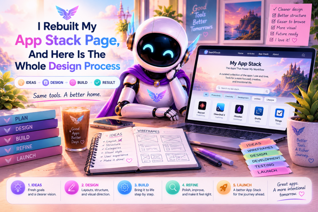
Why The Old Grid Was Plain
Every icon sat in a uniform white box, seven across, same size. Tidy and forgettable. I kept swapping in shinier logos until I realized the problem was not the icons.
The canvas was the problem. White tiles on a white card is the flattest way to show anything. No contrast, no separation, no reason for your eye to stop. However good the icons were, the page never felt alive.
Key Takeaway: Contrast does the hard work for you. White on white never pops, no matter how good the content is.
The Dark Glass Card Changed Everything
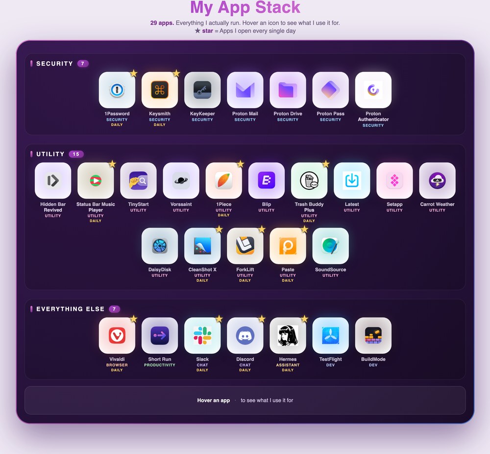
The biggest move was dropping the white background for a dark plum glass card in the middle of my light lavender page. Dark against light is the strongest contrast a page can make, so your eye goes straight to the card whether or not you planned to look.
It needed to feel premium, not just dark. A slow-shifting purple gradient border never quite stops moving, and each icon sits on a white tile with a glow pulled from the app real brand colors. Proton apps glow purple. 1Password glows blue. Vivaldi glows red. Small touches, but together they make the card read as a considered place instead of a generic toolbox.
Adding The Motion That Makes It Feel Alive
A static grid is decoration. Motion is what makes people stop. I added three layers and each one has a job.
First, the tiles cascade in one at a time when the card scrolls into view, like a slot machine filling. It pulls your attention into the grid instead of letting you glance past it.
Second, hovering a tile makes its glow brighten and spread across the card behind it. The icon you are pointing at physically lights up the space around it.
Third, a soft cursor spotlight follows your mouse across the whole card. It is subtle enough that it never fights the content, but it makes every visit feel a little different.
Key Takeaway: Motion is what makes people stop. A static grid reads as decoration no matter how clean it is.
One rule kept me honest through all of it. I added a reduced-motion check, so anyone who has turned off animation in their operating system sees a clean, static card instead. That check is invisible to most people and deeply appreciated by the ones who need it. It is the difference between impressive and polished on purpose.
Making It Tell A Story Instead Of Just Listing Apps
I split the twenty-nine apps into three labeled sections on the card, Security, Utility, and Everything Else, each with its own header and a count. Now the page reads as a choice. Seven security tools on purpose. Fifteen utilities because I like a tuned machine.
Cliff
Then I starred the apps I open every single day. A little gold star on the tile corner with a legend right under the headline so nobody has to guess what it means. Twelve daily drivers out of twenty-nine. That honesty is the part people actually remember. Not every tool on my machine is equal, and the card no longer pretends they are.
I also added a caption bar at the bottom that fills in a one-line reason for each app when you hover it. Hover over 1Password and it says every password in one vault I actually trust. Hover over Carrot Weather and it says a forecast with a personality that never gets boring. That turns the page into an answer to the real question people came with, which is not what do you use, but why.
The First Time I Almost Broke It
The hard part was not the design, it was WordPress fighting me. The Groovy theme ships a CSS rule that draws a thin border around every image on the page, including my icon tiles. Nearly invisible on a light background, it showed up dark card as an ugly ring around every icon.
I spent three rounds removing shadows and borders I thought I had set, and nothing changed. The ring was not mine at all. It came from the theme, and my styles lost to it on specificity. The fix was not to remove a shadow. It was to force my rule to win with the important flag, on the border, the radius, the shadow, and the outline all at once.
Warning: When a style is not taking effect, check the theme before you keep tweaking your own CSS. The culprit is often a theme rule winning on specificity.
The Second Time I Almost Broke It, And It Was Silent
The scarier one was JavaScript. I added a script for the spotlight and entrance animation, checked it locally, and it worked perfectly in the preview. Then I pushed it up and nothing ran. No error, no warning, just a dead page where the card sat still.
The culprit was WordPress quietly escaping the ampersands in my code. It turned the double ampersand that means and in JavaScript into a harmless-looking sequence the browser read as broken, killing the whole script in silence.
The fix was to write the script without any ampersands at all, using nested if statements instead of the logical and. I also stopped trusting the local preview and started verifying the exact bytes the server was actually sending. If you build anything interactive on WordPress, that lesson is worth stealing. The preview is not the source of truth. The served page is.
Pro Tip: Verify the served page, not the local preview. WordPress can quietly transform your JavaScript in ways the preview never shows.
The Result
The card now does a lot. It grabs the eye with the dark glass against my light site. It shows how I work with the category grouping and the daily stars. It answers why with the hover captions. It feels alive with the motion, and it stays polite for people who want it calm.
Most importantly, it looks like nobody else. That is the whole goal. Not the most features, not the most animation. A Uses page that reads as a specific person real setup, made on purpose.
Want More Like This?
I write about AI tools, automation, and the stuff I actually use. If this article helped, there is more where it came from.